Blaise Larmee

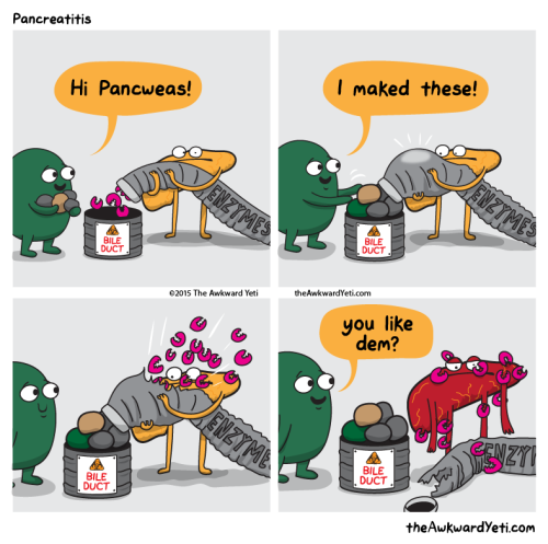
This is basically how Gallbladder can cause pancreatitis.
Holy cow, Susie Cagle‘s new piece on the gentrification situation in Oakland is a barnburner. Here’s how it starts:
Gentrification: We think we know it when we see it. Pour-over organic coffee, double-wide designer strollers, gluten-free options. Millennials and their unrelenting desire to live and work in cities that pushes out longtime residents. A tide rising, cresting and washing over. An act of nature.
These demographic and economic shifts in cities aren’t the result of organic social and cultural trends; the changes are wrought by decades of investment and public policy choices, and inextricably bound to histories of racism, exclusionary land use policies and exploitative banking processes that left certain communities vulnerable to a steamroller of new investment.
“If you don’t know what the problem is you definitely can’t stop being a part of it, and I think a lot of people don’t know what the problem is,” says DeeDee Serendipity, a native of Oakland who now owns a salon in the city.
Read on for an exhaustive examination of how exactly gentrification works and what exactly is happening in Oakland.
No comments | Permalink | Share on Facebook | Tweet this
Login attempts fail because computer users can't remember their email or didn't input the right password. Most websites on the Internet won't tell you which one is actually incorrect.
If you tell an attacker the email address is wrong, they'll try a different one. If you tell them the password is wrong, then an attacker knows that the username is correct, and can go on to try a bunch of passwords for that username until they hit the right one. So sites won't tell you which one is wrong, to try and avoid the information disclosure.
Unfortunately this assumes that there's no other way for an attacker to discover whether a username/email address is registered for a service. This assumption is incorrect.
99.9% of websites on the Internet will only let you create one account for each email address. So if you want to see if an email address has an account, try signing up for a new account with the same email address.
Here are all of the websites above, confirming that an account exists with my email address/username:
So what we've done by promoting "Invalid username or password" is made our login form UX much, much worse, without increasing the security of our product.
If people don't log in to your site every day (every site on the web except Facebook or Google), not remembering credentials is a huge barrier to accessing your site. Don't make it harder by adding a vague error message that doesn't increase your site's security at all.
But there's a tradeoff there between security and UX, I hear you say. I am trying to show you there is no tradeoff, as presented above; you are choosing between a better user experience and a worse user experience.
Here is an actual UX/security tradeoff: you can make the signup process email based. When someone attempts to sign up with an email address, you send them an email to complete the registration process. If they don't control the email inbox, they can't see whether the email address has an account already. This is much more arduous and requires two context switches (go into your email, avoid distraction, wait for email to arrive, click link in email, remember what you were doing on site). I don't recommend this, because of the context switches, though you can implement it.
Otherwise, accept that your login page and your signup pages are targets for malicious behavior, and design appropriately.
Rate limiting can go a fair way to preventing brute force attacks. To find email addresses, an attacker is going to need to try a lot of email addresses and/or a lot of passwords, and get a lot of them wrong. Consider throttling invalid login attempts by IP address or subnet. Check submitted passwords against a dictionary of common passwords (123456, monkey, etc) and ban that traffic extra hard. Exponential backoff (forcing attackers to try again after 1, 2, 4, 8, 16.. seconds) is useful.
Give guidance to users about creating strong passwords. Allow easy integration with LastPass or 1Password.
Add a 2-factor auth option to your website. Encourage users to use it.
Warn users about malicious behavior ("someone is trying to snoop your password") and contact them about suspicious logins.
I would tell him to fix the cuffs on his jeans. They aren’t folded quite evenly.
Also that the grey shirt isn’t really a good color for him. It washes him out.

The relative size of our solar system’s planets, using fruits, by Avi Solomon.
Found at kottke.org.